

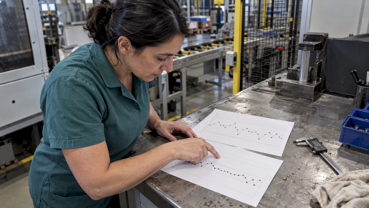
Statistical process control (SPC) is the practice of using control charts and capability measures to keep production processes stable and to catch special causes before they create defects. Done well, it gives you predictable output and earlier warning of process change. We anchor this guide in ISO 7870, the NIST/SEMATECH handbook and ASQ guidance.
TL;DR:
- Use Shewhart charts for steady, high volume lines; choose EWMA for slow or costly testing, and CUSUM when persistent small shifts need detection.
- Calculate Cp and Cpk only after charts show stability; Cp reflects potential when centered, while Cpk captures actual capability and exposes off center drift.
- Build Phase I limits from at least 20 representative points, keep each subgroup close in time, and verify gauges before trusting chart signals.
- Treat trends or long runs as possible signals even inside limits; verify the reading, investigate causes, document fixes, and reset limits only after permanent process changes.
Chart choice is the first decision, and it depends on how fast you produce, how costly each measurement is and how large a shift you need to catch.
In practice, the trade-off is between simplicity and speed of detection. A Shewhart chart is easy to teach and read at the machine, but it reacts slowly to a gentle drift. EWMA and CUSUM detect that drift sooner for the same sampling effort, or let you sample less often for the same sensitivity, at the cost of slightly more setup and training.
Pro Tip: Start with a Shewhart chart on your pilot characteristic. Only move to EWMA or CUSUM once the data shows small drifts that the simpler chart misses.
Process capability compares how wide your process spreads against the width of your specification limits. Cp describes potential capability, what you would achieve if the process were perfectly centred. Cpk reflects actual capability during production, because it also penalises a process that has drifted off centre. A large gap between the two tells you the problem is centring, not spread.
Capability figures are only meaningful when the process is already stable. If special causes are still present, the spread you measure is inflated and the index tells you little. A few practical rules follow:
Report the index together with the sample size and the period it covers. A Cpk without that context invites misreading.
Good charts start with disciplined data. A weak measurement habit produces limits you cannot trust, however elegant the chart.
Pro Tip: Run a measurement system study (gauge R&R) before you plot your first point. If the gauge cannot tell parts apart, the chart will only chart noise.
For a wider view of what to measure, see our overview of quality parameters in manufacturing.
A control chart is a time-ordered plot with a centre line and upper and lower control limits. ASQ lists the common out-of-control signals: a single point outside the limits, plus runs and trend patterns.
Inside the limits does not automatically mean in control. NIST states that a non-random pattern, such as a trend or a long run on one side of the centre line, can mean the process is out of control even when every point sits within the limits. Randomness is the real test.
When a signal appears, follow a short out-of-control action plan (OCAP). NIST stresses that an OCAP is needed to act on signals, not just detect them. A compact version:
Our guide to manufacturing quality control tips goes further on turning findings into lasting fixes.
Roll out SPC in phases rather than across the whole plant at once.
Our quality monitoring workflow guide shows how this fits into daily production routines.
You can start this week with very little. Work through these items in order:
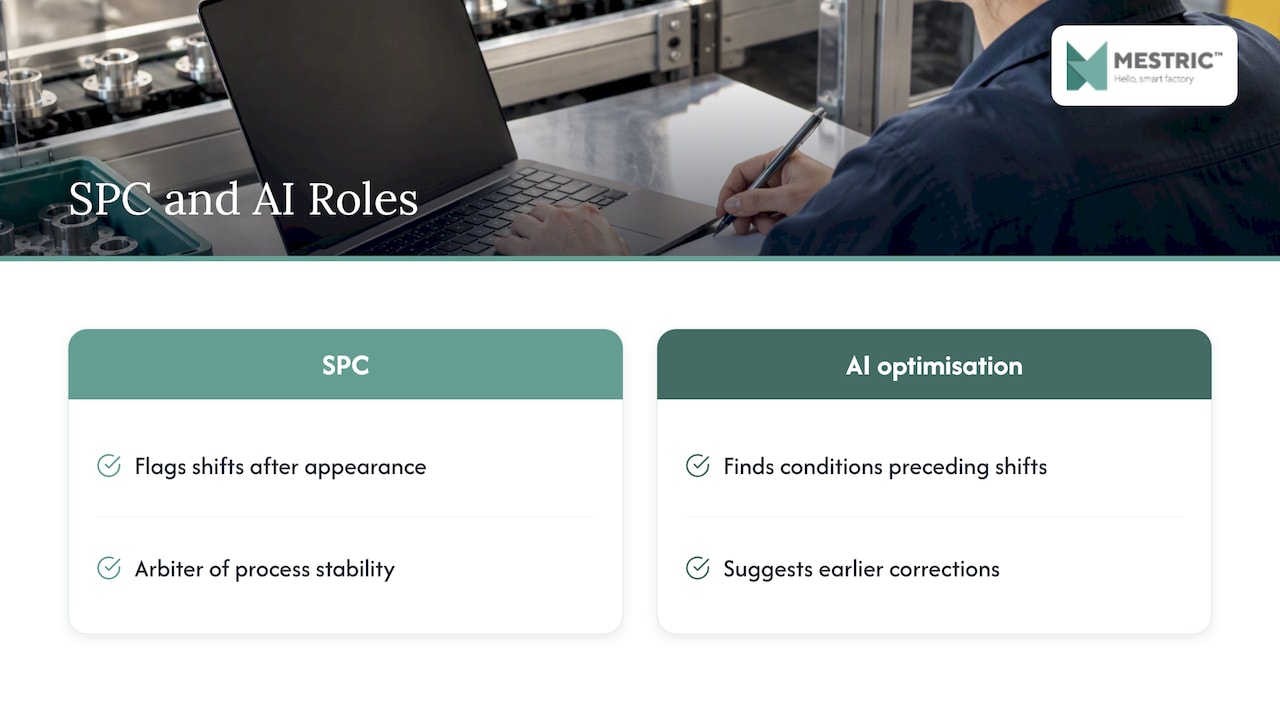
SPC tells you when a process has changed. AI-powered optimisation helps with what to do about it. Control charts are reactive by design: they flag a shift after it appears. Layering analytics on the same live data lets you look for the conditions that tend to precede a shift, such as a combination of machine settings, material batches or ambient conditions that has historically led to drift.
The practical pattern is simple. Clean, time-stamped data from the line feeds your control charts, and the same data feeds models that suggest adjustments to process norms. The chart remains the arbiter of whether the process is stable, while the optimisation layer proposes earlier, smaller corrections so fewer signals reach the point of a stoppage.
This only works if the foundation is sound. Predictive tools trained on unreliable measurements will learn the unreliability. That is why we stress gauge studies and automated capture before anything advanced. Our MES connects directly to equipment and combines live monitoring with AI-powered optimisation tools. Our piece on real-time analytics advantages in manufacturing explains the benefits in more depth.
The pattern across successful SPC rollouts is consistent, even where the details differ by industry. We draw here on illustrative scenarios rather than published figures.
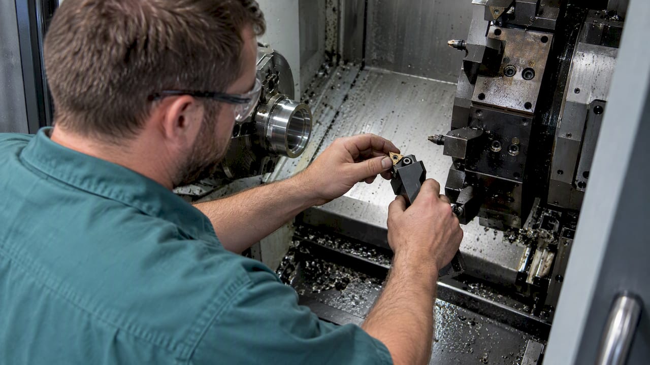
Take a machining line producing a bore diameter. Before SPC, the team inspected finished parts and scrapped those out of tolerance. After introducing an X̄–R chart on the bore, the operator noticed a slow upward trend well inside the limits. Tool wear was the cause. Replacing the insert on a planned schedule, rather than after parts failed, cut scrap and avoided unplanned stoppages.
Or consider a filling line with costly, slow testing. A switch to an EWMA chart let the team detect a small fill-weight drift with fewer samples, which trimmed testing cost while protecting the customer from underfilled units.
In both cases the gains came from the same source: catching change early and acting on a documented plan. The savings show up as less scrap, less rework, fewer complaints and steadier throughput. For further real-world material, see our quality monitoring examples.
Digital manufacturing makes data plentiful, but plenty of data creates its own problems.
Most of these are habits and ownership issues rather than technical ones, which is why training matters as much as software.
Training succeeds when it is tied to the operator’s own machine and decisions, not delivered as abstract statistics.
Refresh the training after the pilot, when real questions have surfaced.
The usual advice treats SPC as a statistics exercise, and that is where many programmes stall. In my view the hard part is rarely the chart. It is getting trustworthy data at the right moment and making sure someone acts on a signal. A modest Shewhart chart with a clear OCAP beats a sophisticated scheme nobody owns.
That is why we place so much weight on automated capture. Live dashboards, direct equipment connectivity and a demonstration centre where you can watch connected machinery in a real setting show how much easier rollout becomes when the numbers arrive without manual effort. Start small, measure properly and respond every time.
— Andraž
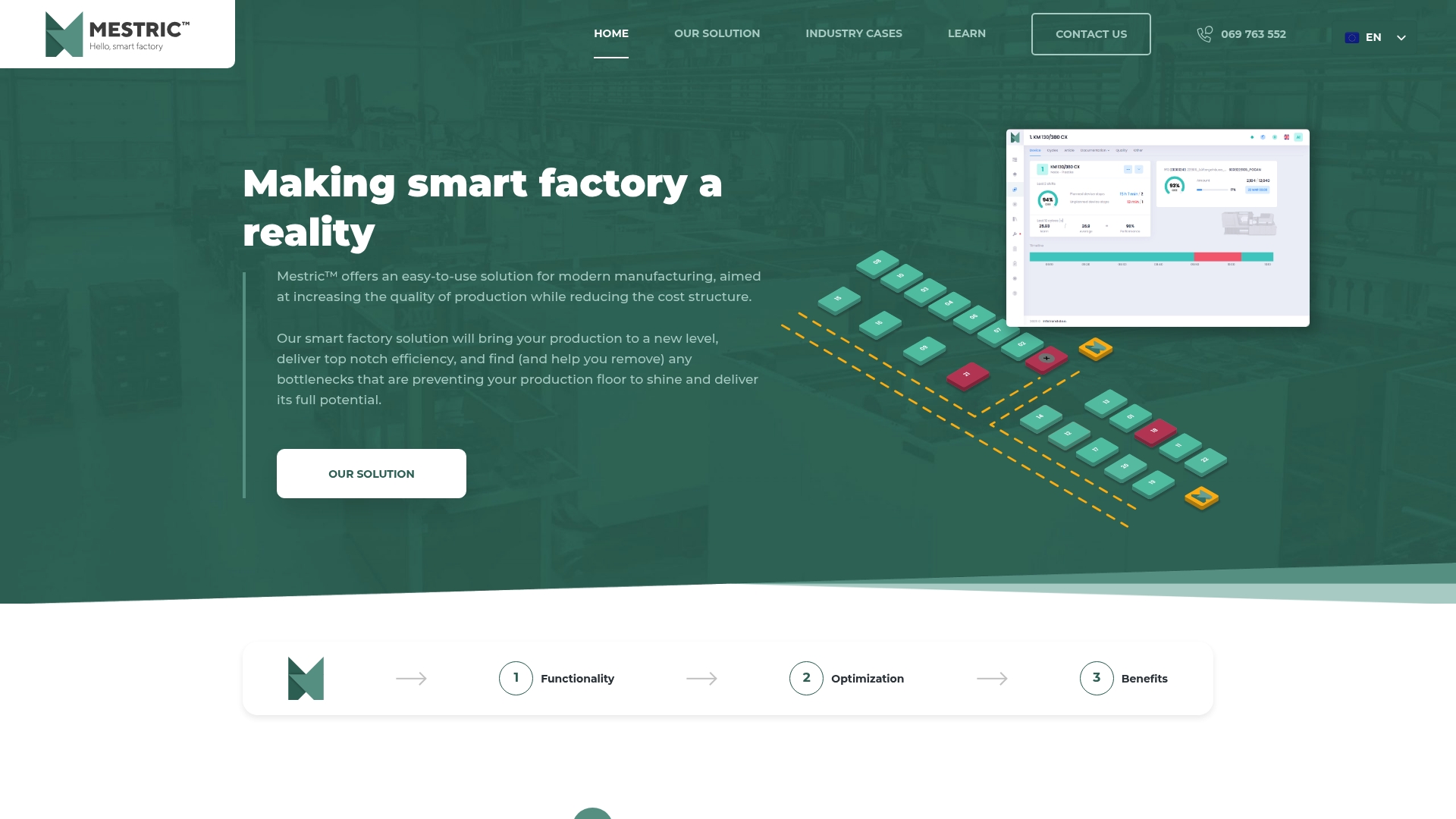
Once your pilot proves the method, manual plotting becomes the bottleneck. Our MES removes it. We connect to your equipment, capture readings automatically and put KPIs in front of the people who can act on them.
When you evaluate any MES for SPC, look for:
We built our MES to support production monitoring. See how Mestric™ MES works and request a demonstration on the product page.
SPC uses control charts to watch a process over time and separate normal variation from real change. It lets you act before defects appear, rather than finding them at final inspection.
Cp shows potential capability if the process were perfectly centred, while Cpk shows actual capability during production. A Cpk well below Cp usually means the process is off centre.
Choose EWMA when production is slow, testing is expensive, or small shifts matter. ISO 7870-6:2024 recommends it in those cases because it detects small to moderate shifts faster.
A common starting point is 20 representative points in Phase I. Collect them from a stable period, then review the limits once real monitoring begins.
Yes. NIST notes that a non-random pattern, such as a trend or a long run on one side of the centre line, can signal an out-of-control process even when every point is within the limits.


 069 763 552