


Data visualisation turns raw factory data into a live operational decision layer that helps your teams act faster, reduce downtime, and improve quality. Teams using live visual analytics report decision-making up to 37% faster compared with end-of-day reporting cycles. That single shift, from delayed spreadsheets to live dashboards, changes how quickly your operators and supervisors can respond to a developing problem on the line.
The core idea is straightforward: your PLCs, SCADA systems, MES, and ERP already generate the data. Visualisation gives that data a usable form, one that an operator can read in seconds and a plant manager can act on in minutes. The role of data visualization in manufacturing is not decorative. It is the mechanism that connects machine signals to human decisions.
Your first action: deploy a single live OEE dashboard on your most critical production line and configure two role-based alerts, one for the operator and one for the supervisor. That pilot will surface more about your data quality and team readiness than any planning document.
Key facts to carry into the rest of this guide:
Factory data visualisation is the graphical, real-time representation of machine, process, and supply data used for monitoring and decision-making. It converts numerical streams from your equipment into charts, gauges, heat maps, and trend lines that people can interpret at a glance. The distinction from a standard report is liveness and context: a dashboard shows you what is happening now, not what happened yesterday.
| KPI | What it measures |
|---|---|
| OEE (Overall Equipment Effectiveness) | Combined availability, performance, and quality rate for a machine or line |
| Throughput | Units produced per hour or shift |
| Yield | Percentage of output meeting specification on first pass |
| MTTR (Mean Time to Repair) | Average time to restore a machine after failure |
| Scrap rate | Proportion of output rejected or reworked |
| Cycle time | Time to complete one production unit |
| WIP (Work in Progress) | Volume of partially completed product in the system |
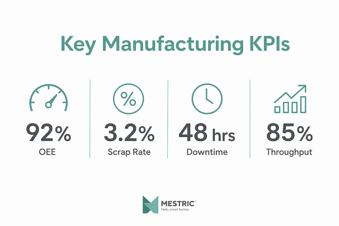
Each of these KPIs becomes meaningful when visualised in context: a scrap rate of 3.2% looks different when you can see it trending upward over the past four hours alongside a temperature deviation on a specific press.
Your visualisation layer draws from several sources simultaneously. PLCs and SCADA systems provide machine-level signals: speed, temperature, pressure, counts. IIoT sensors add environmental and condition data. Your MES captures production orders, operator inputs, and quality results. ERP feeds scheduling, material availability, and cost data. Connecting these sources into a single visual layer is what transforms isolated readings into manufacturing data insights that actually drive decisions.
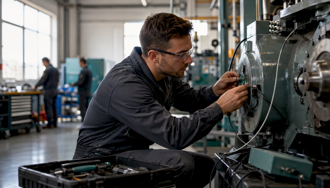
The impact of visualisation in manufacturing shows up in four areas that plant managers and operations directors care about most.
Faster decisions. When your team can see a deviation the moment it occurs rather than at the next shift handover, the detection-to-action window shrinks dramatically. Live dashboards replace the cycle of data collection, manual reporting, and delayed review with a continuous signal that anyone with the right access can read.
Reduced downtime. Condition monitoring visuals, trend lines, and threshold alerts let maintenance teams spot deterioration before it becomes a failure. Predictive maintenance deployments with visualisation have reported up to 50% reductions in production downtime and up to 40% decreases in maintenance costs according to industry case studies.
Throughput and quality gains. An OEE view makes changeover losses visible in real time, so supervisors can investigate and act during the shift rather than after it. Trend visualisation exposes creeping cycle-time drift, the kind that costs you 4% throughput over a week without triggering a single alarm.
Cross-team alignment. The MADE white paper frames this well: a shared visual decision layer breaks the information silos that typically separate production, maintenance, quality, and supply teams. When everyone reads from the same live source, coordination improves and finger-pointing decreases.
Three KPI-focused benefits worth noting specifically:
Pro Tip: Set your live OEE dashboard to display the previous shift’s result alongside the current shift’s live figure. That single comparison gives supervisors an immediate performance reference without any additional reporting.
Choosing the right visual form is as important as having the data. An industrial big data visualisation review published in Engineering recommends matching your visual approach to the data’s characteristics: its dimensionality, whether it streams in real time, and whether it has spatial or temporal structure. That principle translates directly to the shop floor.
The most common starting point. A live OEE board displays availability, performance, and quality as percentage tiles alongside a running production count and a shift target. It gives operators and supervisors a single-glance status check. Colour-coded thresholds (green/amber/red) make deviations visible without requiring interpretation.

These sit at the machine or cell level and show cycle time, current speed, reject count, and active alarms. They are designed for operators, not managers, so the information density is low and the font size is large enough to read from three metres away.
Heat maps display sensor readings across a machine or production area using colour intensity to show where values are elevated or abnormal. They are particularly effective for thermal monitoring of motors, bearings, and tooling, and for spotting spatial patterns in quality defects across a mould or press tool.
Statistical Process Control charts plot measurement data against control limits over time. They are the standard tool for quality monitoring and are most useful when a process parameter is drifting toward a specification limit. An SPC chart makes that drift visible before the limit is breached.
Line charts showing units per hour over a rolling window (shift, day, week) help production managers identify patterns: which shifts consistently underperform, which products have the longest cycle-time variance, and where scheduling changes have had a measurable effect.
These aggregate material availability, supplier lead times, and WIP levels into a single view. They are most useful for operations directors and supply planners who need to anticipate shortages before they stop the line.
A single dashboard rarely serves every role well. Operators need high-contrast, low-density displays with clear alarm states. Supervisors need line-level summaries with drill-down access to individual machines. Operations directors need shift and daily aggregates with trend context. Engineers need raw data access and the ability to overlay multiple parameters for root-cause analysis. Interactive dashboards with embedded drill-downs serve all four without requiring four separate systems.
Design quality determines whether a dashboard gets used or ignored. Peer-reviewed behavioural research shows that well-designed dashboards direct operator attention and support coordination. Poorly designed ones create noise and erode trust.
Humans process colour, shape, position, and size before conscious thought. A red tile on an otherwise green board is noticed in under 200 milliseconds. Designing dashboards to exploit these preattentive features means operators spot anomalies in seconds rather than scanning row by row. This is not a UX nicety; on a fast-moving production line, those seconds matter.
Pro Tip: Map each dashboard view to the standard operating procedure it supports. If an operator sees an amber alert on cycle time, the SOP for that alarm should be accessible from the same screen. Dashboards that connect to procedures get used; dashboards that require a separate manual do not.
Data inputs: vibration sensors, temperature probes, motor current draw, historical failure logs.
Visual form: condition heat maps, trend lines with threshold bands, event timelines.
Before/after: maintenance teams reacting to failures after they occur versus receiving a 48-hour warning when a bearing temperature trend crosses a defined threshold. A systematic literature review of visual analytics in predictive maintenance found that 54% of published work focuses on anomaly detection, confirming this as the highest-value application. Expected outcome: lower MTTR and fewer unplanned stoppages.
Visual exploratory analysis also plays a role before predictive models are trained. Where labelled failure data is scarce, domain experts use visual tools to identify and label anomalies manually, which then improves the precision of the underlying machine-learning model.
Data inputs: measurement system outputs, inspection results, process parameters (temperature, pressure, speed).
Visual form: SPC control charts, Pareto charts for defect categories, scatter plots for parameter correlation.
Before/after: end-of-batch quality reports replaced by real-time control-limit monitoring. Operators see a drift developing and adjust the process parameter before the batch is rejected. Production quality monitoring with live SPC typically reduces first-pass failure rates and rework costs.
Data inputs: machine cycle counts, takt time targets, shift schedules, downtime event logs.
Visual form: live OEE tiles, throughput trend lines, takt adherence gauges.
Before/after: supervisors waiting for end-of-shift reports versus seeing a throughput shortfall develop at hour two and reallocating resource immediately. An Industry 4.0 OEE framework case study demonstrated that live OEE dashboards enabled prompt corrective action on a production machine, reducing operational losses.
Data inputs: production orders, machine availability, changeover times, WIP levels.
Visual form: Gantt-style schedule views, capacity heat maps, WIP trend lines.
Before/after: scheduling decisions made on static plans versus live capacity views that show the downstream impact of a changeover extension or a material delay before it propagates.
Data inputs: ERP inventory levels, supplier lead times, production demand forecasts.
Visual form: traffic-light material status boards, trend lines for stock-on-hand against consumption rate.
Before/after: a line stoppage caused by an undetected material shortage versus a 72-hour visual warning that triggers a procurement action. Cross-team alignment between supply and production is the direct benefit.
Implementation succeeds when it follows a structured sequence. Skipping data validation or governance steps is the most common reason pilot dashboards fail to scale.
| Phase | Activities | Typical duration | Resource owner |
|---|---|---|---|
| Pilot | One line, three to five KPIs, two roles, basic alerts | 4–8 weeks | IT + production lead |
| Scale | Additional lines, full role-based views, MES/ERP integration | 8 weeks | IT + ops manager |
| Embed | Governance, training, continuous improvement cycle | Ongoing | Operations director |
Connector complexity drives the largest variable cost: a modern PLC with OPC-UA support is straightforward; a legacy system requiring custom middleware is not. Data cleansing effort depends on how well your existing systems are maintained. Licensing costs vary by platform. UI design and change management are frequently underestimated. Budget for training and for at least one iteration of dashboard redesign after the pilot.
Pro Tip: Run your pilot on the line with the clearest existing data, not the line with the biggest problem. A clean pilot builds confidence and gives you a working template to replicate. Tackling the messiest data first tends to stall momentum.
Most visualisation projects that underdeliver share the same failure modes. Knowing them in advance is the most efficient form of risk management.
Fragmented data and silos. When each department owns its own system and there is no integration layer, dashboards show partial pictures. The fix is a governed data integration architecture that connects PLCs, MES, ERP, and quality systems into a single source of truth before any visual layer is built.
Poor data quality. A live dashboard that displays incorrect values is worse than no dashboard. Automated data validation rules, applied at the point of ingestion, catch timestamp errors, unit mismatches, and out-of-range readings before they reach the screen. Sensor data integrity is a prerequisite, not an afterthought.
Static dashboards. Applied visualisation research argues that hard-coded dashboards fail as process norms shift. Thresholds that were correct six months ago may now be irrelevant. Build dashboards with configurable thresholds and interactive drill-downs so they remain accurate as your processes evolve.
Alert fatigue. Too many low-priority alerts train operators to ignore them all, including the important ones. Use tiered thresholds: a warning state before an alarm state. Aggregate nuisance alerts into a summary rather than firing individually. Review alert logs monthly and suppress any alert that has not triggered a meaningful action in 30 days.
Missing domain context. A visualisation built without input from the people who work the line will miss the context that makes data meaningful. Involve operators, maintenance technicians, and quality engineers in the design process. They know which parameters matter and which are noise.
User resistance. Dashboards that feel like surveillance tools get sabotaged or ignored. Frame visualisation as a support tool, not a monitoring tool. Show operators how the dashboard helps them, not how it reports on them. Quick wins in the first two weeks of a pilot build the momentum that sustains adoption.
Measuring ROI requires a baseline. Before your pilot goes live, record the current values for the KPIs you intend to improve: MTTR, OEE, scrap rate, and the average time from fault occurrence to corrective action. Without a baseline, you cannot demonstrate improvement.
The core calculation focuses on downtime cost:
Savings = (reduction in downtime hours per month) × (cost per hour of downtime) + (reduction in scrap and rework cost per month)
For predictive maintenance specifically, add the avoided emergency maintenance premium (typically 20–40% higher than planned maintenance cost).
| Input | Before visualisation | After visualisation |
|---|---|---|
| Unplanned downtime per month | 18 hours | 10 hours |
These figures are illustrative. Your actual numbers will depend on your line speed, product value, and maintenance structure. The point is to run the same calculation with your own baseline data.
Teams that follow a structured pilot approach typically see measurable gains within 60–90 days of deployment. The first signal is usually a reduction in the time from fault detection to corrective action; OEE and scrap improvements follow as teams build confidence in the data.
The most useful framing for manufacturing leaders comes from two bodies of evidence: industry white papers on data architecture and peer-reviewed behavioural research on how dashboards change shop-floor behaviour.
The MADE white paper describes visualisation not as a reporting tool but as a shared operational decision layer that sits between raw machine data and human action. When production, maintenance, quality, and supply teams all read from the same live visual source, the coordination cost of cross-functional decisions drops. Disagreements about what the data says disappear because there is only one version.
Behavioural research supports this directly. A peer-reviewed study found that visual affordances on dashboards help operators notice deviations and coordinate actions, supporting cultural change toward operational excellence. The mechanism is preattentive processing: colour, position, and shape are processed before conscious attention, which means a well-designed dashboard reduces the cognitive load of anomaly detection from minutes to seconds.
A systematic literature review of visual analytics in predictive maintenance adds a practical note: where labelled failure data is scarce, visual exploratory analysis by domain experts is the most effective way to build the training data that predictive models need. Visualisation is not just an output layer; it is an input to your AI and ML capabilities.
Pro Tip: When planning your pilot, involve one operator and one maintenance technician in the dashboard design session. Their input on which parameters are genuinely informative versus which are noise will save you weeks of iteration after go-live.
Data visualisation in manufacturing is most effective when it is treated as a shared operational decision layer, not a reporting add-on, and when it is designed for specific roles with governed data and clear thresholds.
| Point | Details |
|---|---|
| Start with a live OEE dashboard | Deploy on your most critical line first; configure role-based alerts for operator and supervisor. |
| Design for roles, not for data | Operators need high-contrast status views; directors need trend summaries; engineers need drill-down access. |
| Measure your baseline first | Record MTTR, OEE, and scrap rate for four weeks before go-live so you can calculate real ROI. |
| Govern your thresholds | Assign a data owner per KPI and review alert rules monthly to prevent alert fatigue and data drift. |
| Mestric as your MES foundation | Mestric connects PLCs, IIoT sensors, and ERP into live KPI dashboards with AI-powered optimisation built in. |
Most articles about data visualisation in manufacturing focus on the technology. The harder problem is governance, and it is the one that determines whether a pilot becomes a permanent capability or a forgotten screen on the factory wall.
The research is clear: dashboards change behaviour when they are trusted, role-appropriate, and connected to a clear action. They fail when the data is stale, the thresholds are wrong, or no one owns the responsibility for keeping them accurate. A plant manager who launches a visualisation project without assigning data ownership and a review cadence will find, six months later, that the dashboards are still running on the original thresholds from the pilot, that three KPIs are showing incorrect values because a process change was never reflected in the system, and that operators have stopped looking at the screens.
The fix is not more technology. It is a governance structure: a named owner for each KPI, a monthly review of alert rules, and a process for updating thresholds when production norms change. That structure is unglamorous, but it is what separates a visualisation initiative that delivers sustained ROI from one that delivers a good pilot and then quietly fades.
For UK manufacturers specifically, the opportunity is significant. The combination of Industry 4.0 connectivity, modern MES platforms, and accessible visualisation tools means that live, role-based dashboards are no longer the preserve of large automotive or aerospace plants. A mid-sized precision engineering firm or a food manufacturer with 50 people on the shop floor can deploy a working OEE dashboard in under eight weeks. The barrier is not cost or complexity. It is the willingness to treat data governance as a leadership responsibility rather than an IT task.
Factories that have connected equipment but no live visual layer are leaving decisions to instinct rather than data. Mestric changes that directly: the platform connects to your PLCs, IIoT sensors, MES, and ERP, and surfaces live KPI dashboards for operators, supervisors, and plant managers without requiring a custom development project.
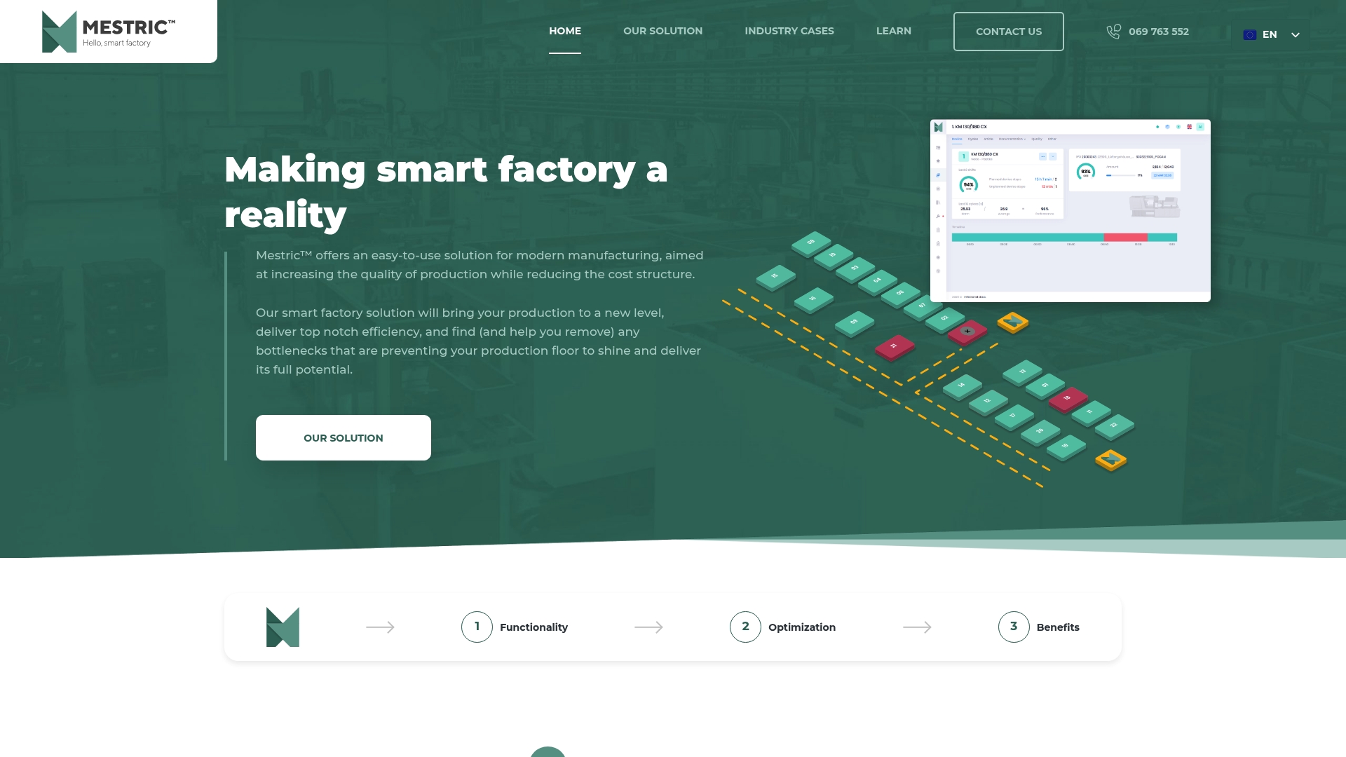
Where a traditional MES gives you data storage, Mestric gives you a real-time performance tracking layer with AI-powered optimisation built in. OEE, downtime analysis, quality monitoring, and cost analytics are all visible in role-appropriate views from the moment your equipment is connected. For UK manufacturers looking to move beyond end-of-shift reports and into live operational decision-making, Mestric is the practical starting point.
The MES versus traditional manufacturing comparison is worth reading if you are still evaluating whether a platform investment is justified. If you are ready to see what live dashboards look like on your own production data, book a demonstration and Mestric will show you the system on your own line.
The following sources were used in preparing this guide. Each is worth consulting directly if you need empirical depth or technical implementation detail.


 069 763 552