


Pareto analysis reveals the small number of causes producing most of your production losses or defects, and with good data, it lets you fix the issues that deliver the largest gains. It works best on measures you already track:
Before you trust the results, you need a stable performance baseline. Skip that step and the chart will mislead you.
Reliable Pareto analysis in production depends on a validated baseline, consistent event labelling, and pairing prioritisation with root-cause tools before acting on results.
| Pont | Részletek |
|---|---|
| Start with a baseline | Confirm OEE, cycle time, and defect rate figures reflect normal conditions before running Pareto. |
| Match the measure to the goal | Use frequency for common issues, downtime minutes for capacity loss, and cost for budget impact. |
| Fix labelling before charting | Inconsistent categories and oversized “other” buckets are the most common source of a misleading chart. |
| Combine with root-cause tools | Follow up the vital few with Ishikawa diagrams or FMEA before committing to a fix. |
| Automate capture for accuracy | Platforms like Mestric record every stop consistently, reducing the manual bias that distorts short-stop data. |
Pareto analysis ranks causes by their impact, then shows what share of your total problem comes from each one. The idea traces back to Joseph Juran’s quality management writing, which separated the “vital few” problems worth management attention from the “useful many” that can simply be standardised.
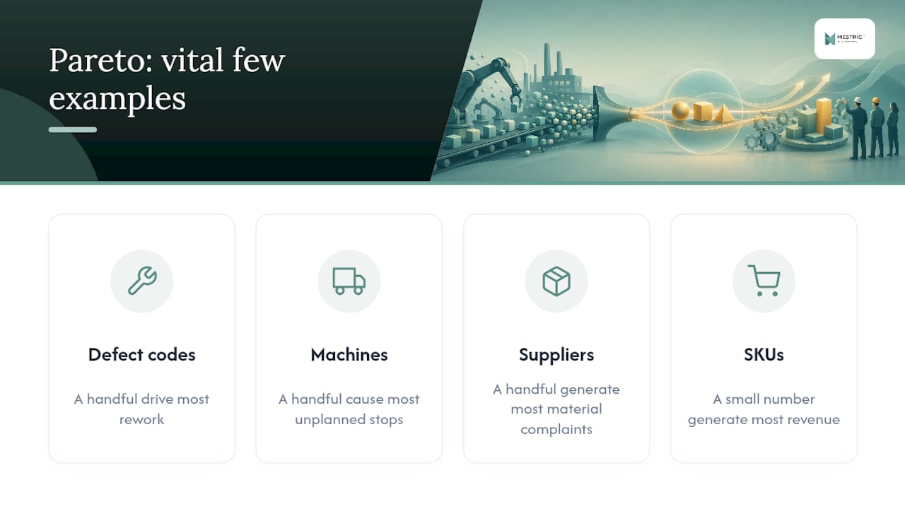
On a factory floor, that split shows up everywhere. A handful of defect codes usually drive most rework. A handful of machines cause most unplanned stops. A handful of suppliers generate most incoming-material complaints, and often a small number of SKUs generate most of your revenue too.
The 80/20 split is a rough guide, not a law. The share of causes driving most losses can vary widely. Treat the ratio as a starting expectation, not a target to force your data into.
Pareto analysis only works once you have something stable to measure against. You need:
Hold off if a line is brand new, if you’re still working with a handful of data points, or if the product mix changes so often that this month’s causes bear no resemblance to last month’s. Once conditions settle, a quarterly review works well for most plants, with an extra pass after any major process change, new equipment install, or supplier switch.
Start by choosing the measure that matches your actual objective. Frequency counts tell you which problem happens most often. Downtime minutes tell you which problem costs the most capacity. Scrap or rework cost tells you which problem hits the budget hardest. Pick the one tied to the decision you actually need to make, because a high-frequency issue and a high-cost issue are sometimes two different animals entirely.
Profi tipp: Build your first Pareto chart in a spreadsheet before automating anything. Manually tallying even one week of data will expose weak category labels faster than any dashboard will.
Capture the right baseline metrics and the chart earns your trust. Miss them, and you’re prioritising noise.
Record OEE, cycle time, defect counts, and downtime reasons at minimum, tagged consistently by shift and by line. The most common ways a Pareto chart goes wrong all trace back to labelling:
Data normalisation is often the weak link in manufacturing Pareto charts. Short-duration stops lasting only seconds get folded into broad, vague labels, which hides the true top causes. Fixing the labelling rules, or switching to automatic signal thresholds, typically reveals a different vital few entirely.
Automated event capture through machine signals or an MES platform removes most of this bias, because the system timestamps and categorises stops the same way every time, on every shift, without relying on an operator’s memory or motivation to log them accurately.
Read the cumulative line, not just the tallest bar. A sensible cut-off usually falls where the top 20 to 30% of causes account for the bulk of your losses, but let the actual curve guide you rather than forcing a round number.
Three pitfalls catch teams out repeatedly:
Once you’ve identified the vital few, don’t treat that list as the finished job. Pareto is a prioritisation tool, not a diagnosis, and pairing it with an Ishikawa (fishbone) diagram or an FMEA gets you from “this is the problem” to “this is why it’s happening.” Pilot a countermeasure, then measure the same metric against your original baseline to confirm it actually moved.
Manual data entry is the single biggest source of bias in most factory Pareto charts. Operators under-report short stops, round timings, and default to vague categories when they’re busy, which quietly reshapes which causes look “vital.” Research on Pareto and 80/20 decision-making points to automated signal capture as the fix, because it records every stop consistently regardless of how busy the line is.
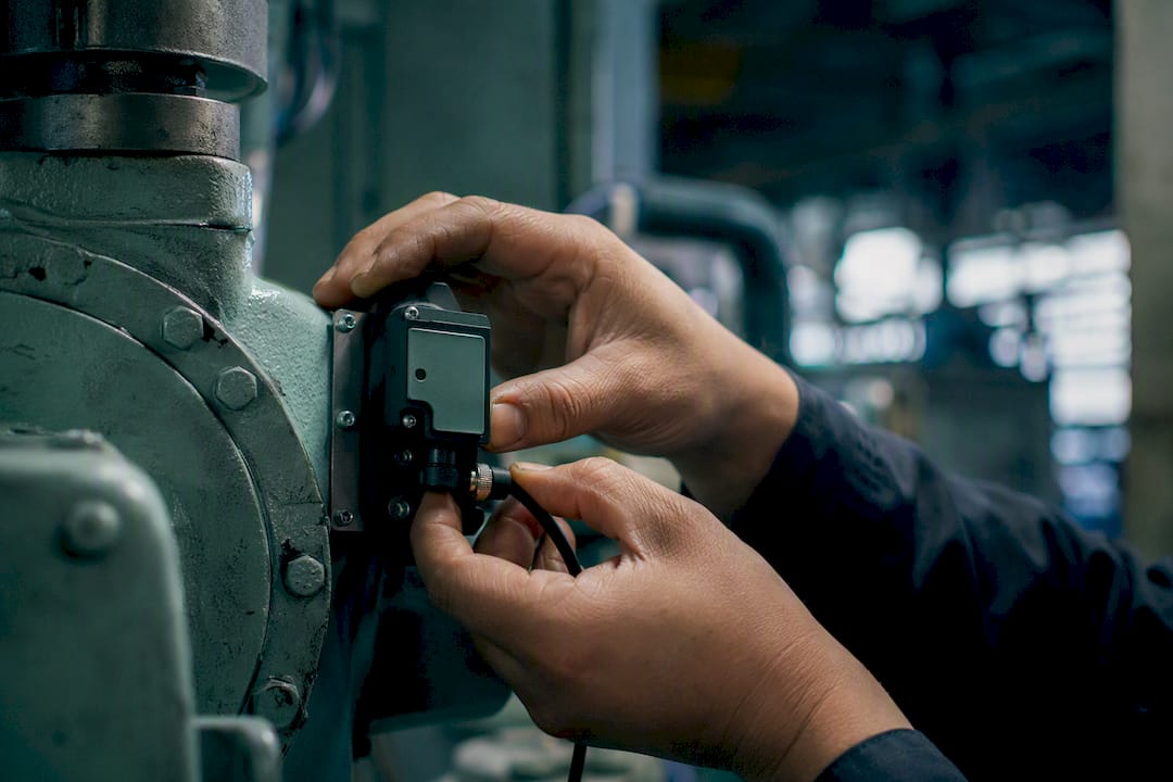
Once countermeasures go in, you need to verify them against the same baseline, checking throughput, downtime minutes, and first-pass yield before and after. This is exactly where an MES platform such as Mestric’s real-time production monitoring earns its place: it timestamps events consistently and gives you a clean before-and-after comparison instead of a debate about whose log was more accurate.
Profi tipp: Run your first automated Pareto against the same period you last measured manually. Comparing the two versions side by side often reveals just how much manual labelling was hiding.
Say a line logs downtime minutes across five categories over a month:
The next move isn’t buying new equipment. It’s a short root-cause check on why changeovers run long, followed by a two-week pilot of a revised changeover checklist, measured against this month’s baseline.
Run your first Pareto pass on a single line, with tight labelling rules agreed in advance, before rolling it out plant-wide. Broad rollouts inherit whatever mess exists in your category definitions.
Check the “other” bucket and the short stops before you trust any chart. They’re usually where the real vital few is hiding, not in the categories everyone already suspected.
— Andraž
Mestric gives you the one thing a spreadsheet Pareto chart can’t: a downtime and defect log that’s captured automatically, the same way, on every shift, without depending on an operator remembering to write it down.
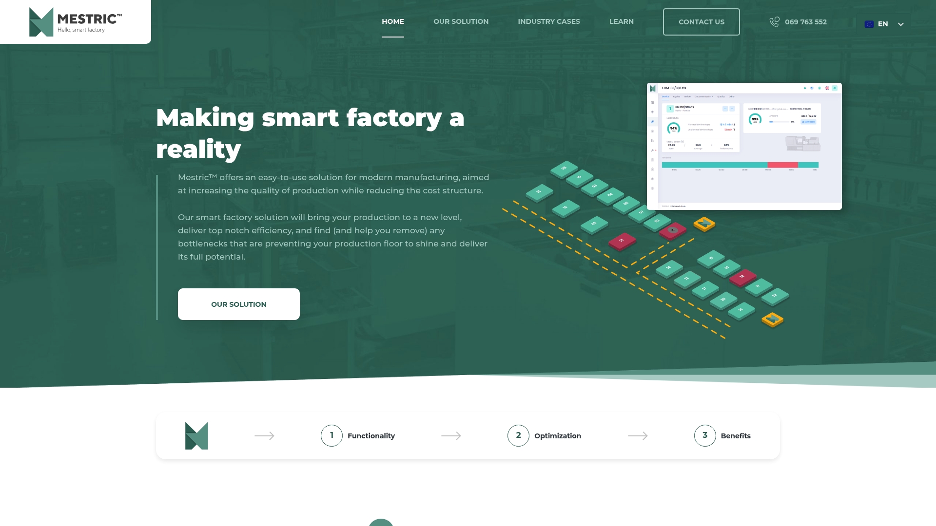
That consistency changes what a Pareto chart can tell you. Short stops that used to disappear into an “other” bucket get their own timestamped category. Once a countermeasure goes live, you can track throughput, downtime minutes, and first-pass yield against your existing baseline instead of relying on parallel manual logs. Mestric connects directly to your equipment, so the data behind every bar in your chart is the same data your operators see on the floor in real time. If you’re weighing this against a traditional manufacturing setup, the difference shows up fastest in how quickly you can trust your own numbers. Request an onsite demo to see how it handles your own downtime categories before you commit to anything.
For deeper detail, see Investopedia’s Pareto analysis guide, OEE baseline guidance, and Mestric’s downtime analysis resource.


 069 763 552