


TL;DR:
- Factory data visualization transforms raw factory data into visual formats that support faster, more accurate decisions. It links multiple data sources to provide real-time insights, enabling proactive responses and continuous improvement across manufacturing operations.
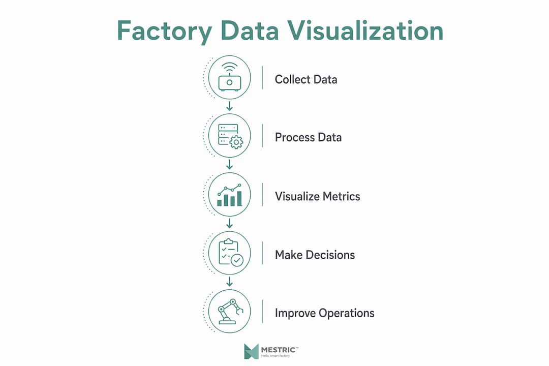
Factory data visualization is the process of converting raw manufacturing data into visual formats such as dashboards, charts, and heat maps, so that anyone from a floor operator to a plant director can understand production performance at a glance. Rather than sifting through spreadsheets or waiting for end-of-shift reports, your team gets a living picture of what is happening on the shop floor right now. The shift this represents is not cosmetic. It moves manufacturing from passive, static reporting to active, data-driven decision-making.
Primary data sources feeding these visuals include programmable logic controllers (PLCs), Manufacturing Execution Systems (MES), Enterprise Resource Planning (ERP) systems, IIoT sensors, and transactional business systems. Together, they supply the raw signals that visualization tools translate into something your team can act on immediately.
Key elements of effective factory data visualization:
Most factories generate far more data than they use. The gap between data collected and data acted upon is where efficiency losses hide, and manufacturing data visualization closes that gap by translating complex signals into patterns the human brain processes quickly and reliably.
The practical benefits span every level of the organisation:
Reduced unplanned downtime, tighter quality control, faster root cause analysis, and shorter improvement cycles are the concrete outcomes. Organising metrics and enabling drill-down views in dashboards dramatically shortens decision times and improves resource deployment across the factory floor.
The human brain is highly receptive to visual information, which is why well-designed graphics outperform raw numeric reports for communicating production status in industrial environments. Turning a column of numbers into a colour-coded gauge or a trend line is not decoration. It is the difference between a problem spotted in seconds and one that festers for an entire shift.
Manufacturing data visualization covers a range of visual formats, each suited to a different analytical task. Choosing the right type for the right question is as important as having the data in the first place.
| Visualization type | Best used for | Typical data source |
|---|---|---|
| Dashboard | Live KPI overview across the plant | MES, ERP, PLC, IIoT sensors |
| Line chart | Trend analysis over time | MES, historian |
| Heat map | Defect or downtime hotspot identification | Quality system, MES |
| Gauge / dial | Single-metric status vs. target | PLC, MES |
| Pareto chart | Ranking defect or downtime causes | Quality system, ERP |
| Scatter plot | Correlation between process variables | Historian, sensor data |
A well-architected system pulls all these formats into a unified platform, so your team is not toggling between disconnected tools to build a complete picture.
Getting data onto a screen is straightforward. Getting the right data onto the right screen, in a format that genuinely informs decisions, is where most implementations run into difficulty.
The most frequent obstacles:
Anticipating these challenges before deployment saves considerable rework later.
The clearest way to understand what factory data visualization does is to see it working in a real production context.
Real-time production monitoring. A live dashboard pulls data from PLCs and IIoT sensors to display which machines are running, which are idle, and which have faulted. A tablet beside a packaging line shows actual versus target throughput and flashes amber when downtime exceeds five minutes, prompting the operator to investigate immediately rather than waiting for a supervisor’s walkround.

Quality control. A heat map of defect rates by station, updated continuously from the quality system, lets a manufacturing analyst identify that the majority of rejects originate at a single press. That single visual is enough evidence to raise a maintenance request and prevent further scrap accumulating across the shift.
Performance tracking and OEE management. A single dashboard merging real-time OEE readings, inventory positions, and customer order status can flag bottlenecks before they threaten delivery schedules. Supervisors see the problem forming, not the consequence of it.
Resource mobilisation. When multiple core process indicators turn red on a consolidated dashboard, a plant manager can immediately identify which work cells are underperforming, mobilise the relevant shift supervisor, and initiate corrective action before the next shift begins. The improvement cycle shortens because the right information reaches the right person without delay.
Effective data visualization gives everyone on the team a living picture of plant performance in real time, rather than delivering yesterday’s static report. The payoff is faster decisions, leaner processes, and a sharper competitive edge.
Process improvement cycles. When visualisation tools surface patterns consistently, they feed directly into continuous improvement programmes. Teams stop reacting to crises and start identifying systemic issues before they become crises.
The most common mistake in factory visualisation projects is starting with the data rather than the decision. Before designing a single chart, identify what question each visual needs to answer and who will be looking at it.

Pro Tip: Start every dashboard design session by asking: “What decision does this screen need to support, and who is making it?” A dashboard built around a decision is always more useful than one built around available data.
The 4M framework (Material, Machine, Method, Man) provides a practical structure for contextualising factory metrics. Linking equipment performance data to the material lot running at the time, the operating mode in use, and the operator on shift transforms a simple alert into an explanatory narrative. Instead of knowing that a machine deviated, you understand why it deviated and under what conditions it is likely to recur.
Emerging research confirms that industrial big data visualization increasingly integrates AI and machine learning with human perception, moving beyond simple monitoring towards interactive decision-support tools that surface anomalies automatically. In 2026, the factories gaining the most from their data are those combining computational intelligence with well-designed human-facing displays.
| Best practice | Why it matters |
|---|---|
| Start with the decision, not the data | Keeps dashboards focused and avoids information overload |
| Apply the 4M framework | Adds context to metrics, enabling root cause analysis |
| Consolidate measures into drill-down dashboards | Reduces fragmentation and speeds up resource allocation |
| Use role-based views | Operators, supervisors, and executives need different metrics |
| Integrate AI/ML alerting | Surfaces anomalies before they become visible to the human eye |
| Validate data freshness | Stale data destroys trust in the system |
Visual accuracy matters as much as visual clarity. A chart that simplifies too aggressively can mislead as badly as one that overwhelms. The goal, as data visualisation principles consistently emphasise, is to communicate clearly without losing the nuance the data actually contains.
Factory data visualization tools range from general-purpose business intelligence platforms to purpose-built manufacturing systems. The right choice depends on how deeply you need to connect with shop-floor data sources.
General-purpose BI platforms such as Microsoft Power BI, Tableau, and Qlik offer strong charting libraries and connectivity to ERP and database sources. They work well for management-level reporting and trend analysis but typically require additional integration work to connect directly with PLCs and MES systems.
MES-integrated visualization platforms connect directly with manufacturing equipment and operational technology, providing real-time dashboards without the integration overhead. Mestric’s MES, for example, links directly with production machinery to deliver role-based dashboards covering performance metrics, downtime, quality parameters, and cost analysis in a single interface. The advantage is that the data pipeline from machine to visual is managed within one system, reducing latency and the risk of data gaps.
Historian and SCADA systems such as OSIsoft PI (now AVEVA PI) capture high-frequency sensor data and provide trend visualisation at the equipment level. They are the foundation for detailed process analysis but typically need a BI layer on top for broader operational dashboards.
IIoT platforms aggregate sensor data across the plant and feed it into visualisation layers, often with built-in alerting and anomaly detection. They are particularly useful in environments with large numbers of connected assets.
The practical reality for most UK manufacturers is a combination: a MES or IIoT platform handling real-time shop-floor data, connected to a BI tool for management reporting. The critical requirement is that data flows between layers without manual intervention, so visuals stay current. Understanding the advantages of real-time analytics helps you evaluate which combination fits your production environment.
The quality of any factory visualisation depends entirely on the quality and completeness of its underlying data. Knowing where your data comes from and which metrics to prioritise is the foundation of a useful system.
Primary data sources:
Key metrics to visualise:
Connecting these metrics to the right factory performance tracking workflow ensures that your visualisation system answers the questions your team actually needs to make decisions, rather than simply displaying what is easiest to collect. Industrial data practices in markets across Europe, including guidance on how data improves industrial processes, increasingly emphasise structured data integration as the prerequisite for visualisation that genuinely supports operational decisions.
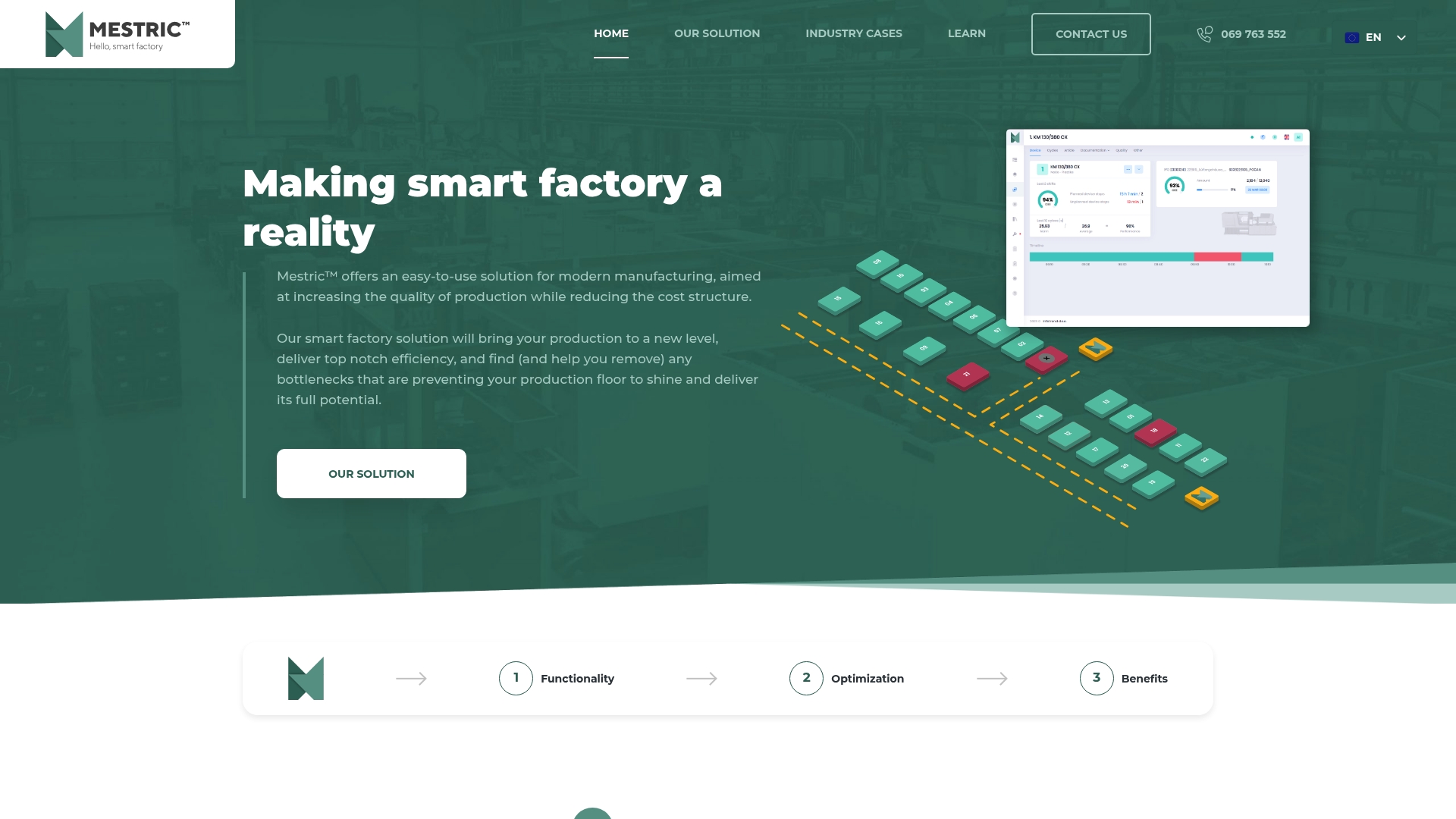
Mestric’s MES connects directly with your manufacturing equipment to deliver role-based dashboards that bring together performance metrics, downtime tracking, quality monitoring, and cost analysis in one place. There is no manual data export, no waiting for a report to be compiled. Your production managers see what is happening now, and your operators see exactly the information they need to act.
If you want to see how connected machinery translates into clearer decisions on your shop floor, explore how Mestric compares to traditional manufacturing approaches and request an onsite demonstration.
Factory data visualization converts raw manufacturing data into visual formats that enable faster, better-informed decisions at every level of the organisation.
| Point | Details |
|---|---|
| Definition | Factory data visualization converts PLC, MES, ERP, and sensor data into dashboards, charts, and heat maps for rapid comprehension. |
| Core benefit | Drill-down dashboards dramatically shorten decision times and improve resource deployment across the factory floor. |
| Right tool choice | MES-integrated platforms reduce latency by managing the data pipeline from machine to visual within one system. |
| 4M framework | Linking machine, material, method, and operator data turns alerts into explanatory narratives that support root cause analysis. |
| Design principle | Start with the decision each screen must support, not with the data available, to avoid fragmented and overloaded dashboards. |


 069 763 552